- 首页
- International
- 艾特奖
- 文化节
- 服务体系
-
网站导航
书房总是带给人灵感的启发和精神的慰藉,设计师秉着“爱”的初衷,悉心体察业主夫妇生活中的点滴细节,特意调整了书房格局,使其更开阔,并选择了超大书桌,让业主夫妇可同时遨游在知识的海洋里。美在于物,而存于心。设计不仅仅是外在美观,而且需要考虑到用户的使用过程、场景、行为与需求,甚至上升到哲学层面。
The ultimate luxury, the most beautiful style of life!
Extreme elegance and luxury, the most beautiful style of life!
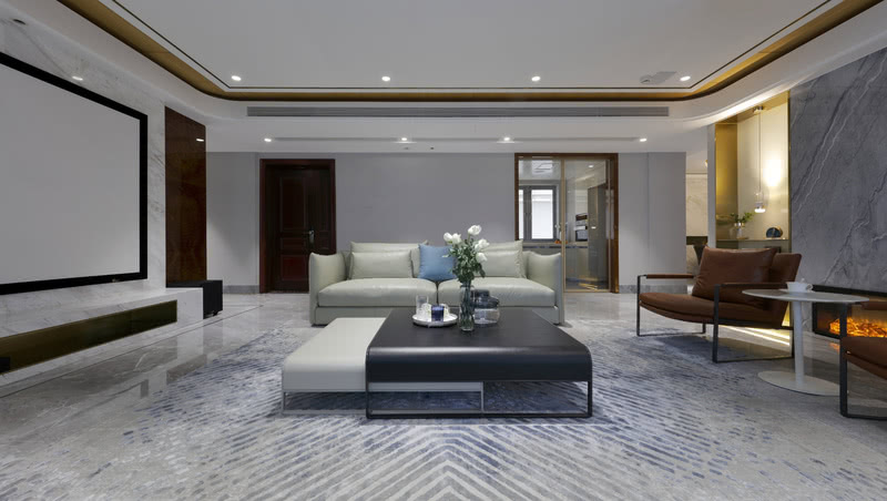
270 ㎡ modern wind in large scale space, stylist is applied vision, black and white contracted department give priority to with warm soft outfit with the metal line, present the right sense of luxury. The design of jindu haishang plans the space with human scale, combing the horizontal and vertical moving lines of the space, inheriting the poetry and warmth, showing the fashion and luxury with metal, and creating a poetic dwelling space through artistic beauty and home furnishing. The designer takes "elegance and luxury" as the core of the style of space design, with modern grey and white as the main color tone, and natural light and shadow as well as the ornament of furniture furnishings and fireplace make it radiate artistic vitality.
In longxi after building structure and analysis of the habits and customs of owner, stylist to redefine the vertical line, combing layout: the owner couple has a powerful film, the fast pace of modern life, busy with work during the day, and entertaining friends and daily household chores, rarely slightly free, just hope settled down to watch a good movie with a loved one, so the designer integrates the original sitting room dining-room, make originally scattered layout as a whole, widen the pattern and vigour of whole sitting room. The curtain of pine green is showing a halcyon temperament, replaced traditional liquid crystal TV with large - scale projection. At home at any time with the moment can feel fully dripping film plot! Designers to life - home - love for inspiration, to create a comfortable and harmonious taste family!
Bring the environment into life, bring life into the environment. The French window that reachs 6 meters wide shows outdoor beautiful scenery completely, what what all enter eye ground is the picture scroll of seascape of a find the scenery pleasing to both the eye and the mind making a person. The French window of large measure opens close have degree, beautiful sunshine shines into indoor, the ripple on the ground glimmer, of sofa soft, of metal luxurious, of crystal bright, sweet atmosphere, the resonance of music... Space is not only visual, but also can be felt and touched by the five senses.
After the structural adjustment of dining-room original, guest dining-room becomes fully open, pass contracted gimmick, change square for the circle. Continue exalted and refined atmosphere, take luxuriant annular droplight slightly, add the French window that shows one side fully, present elegant and comfortable have dinner environment.
The design is a balance of sensibility and rationality. Oak floor is laid in the main bedroom, with a delicate and warm touch. The head of a bed the background with the grain rich hard package inlays the metal to serve as the partition, the proportion is accurate, is just right! With quiet colors and fashionable metal and hermes orange, it creates a noble and luxurious living space, and reveals a kind of gentle and elegant beauty with power... The simple sense of detail place is the existence that can experience costly most, implicative, and take some arrogant, it is extremely after gorgeous simple, it is the dimensional temperament with low-key indifferent
Texture is the real aesthetic feeling of art, whether it is a lifelike performance, or freehand feeling description, are creating an extreme experience of beauty.
The natural sunlight outside the window provides a warm space atmosphere in the master bedroom. Looking at the open field of vision from the floor-to-ceiling window, what comes to you is the light of the morning light, and the warmth in the floor...
Second lie is given priority to with high-grade ash. Gray is a mixture of black and white, and the result is neither black nor white, but a special new middle color. This mix comes not only from color, but also from the comfort of the intersection of intimate and open Spaces. The harmony between the pure white and the grey makes the space into a cold and hot poem. Seemingly simple craft and material, but with the beauty and depth of contemporary design, contains the tension of advance and retreat, advocating the nature of the simple core, inadvertently touch the bottom of my heart.
The study always brings the inspiration of person inspiration and the solace of the spirit, stylist is holding "love" original intention, careful body inspects a few details in owner couple's life, adjusted study pattern designably, make its more open, chose to exceed large desk, let owner couple can roam at the same time in the ocean of knowledge. Beauty lies in the things, but in the heart.
Design is not only about external beauty, but also about users' perception of life. It is more about the embodiment of individual value and deep self-identity, even rising to the level of philosophy.

客厅

客厅

客厅